Driver Partner Statement
Regaining driver trust through financial transparency and clarity across Southeast Asia.
8 min read

Context
Three Wallets, Zero Clarity
The Trust Deficit In the early days of Grab, our driver ecosystem was growing rapidly, but trust was lagging. As a Product Designer on the Driver Experience team, I tackled a critical friction point: financial transparency. At the time, drivers struggled to answer a simple question: “How much did I actually earn?”
The experience was defined by the friction of hybrid financial flows. Drivers were forced to juggle three distinct 'wallets': physical cash on hand from fares, a digital Cash Wallet for reimbursements, and a pre-paid Credit Wallet for commissions. While this fragmented infrastructure remains a necessity in some markets to this day, it forced drivers to rely on manual personal bookkeeping and generated a massive volume of calls to our Help Centre to dispute earnings.
To remove the cognitive burden of constant mental reconciliation, I consolidated these segmented data streams into a unified financial record. My objective was to establish one source of truth, a reliable overview that abstracted backend complexity into a clear and accessible experience.
This initiative laid the groundwork for total financial transparency. It evolved into a cohesive ecosystem that later expanded to include the Driver Earnings History and enriched Trip Details, ensuring that the complete earnings path, from single trip receipts to weekly summaries, became transparent and verifiable. This work established a standard for financial clarity that remains central to the driver experience today.
Context
Three Wallets, Zero Clarity
The Trust Deficit In the early days of Grab, our driver ecosystem was growing rapidly, but trust was lagging. As a Product Designer on the Driver Experience team, I tackled a critical friction point: financial transparency. At the time, drivers struggled to answer a simple question: “How much did I actually earn?”

The experience was defined by the friction of hybrid financial flows. Drivers were forced to juggle three distinct 'wallets': physical cash on hand from fares, a digital Cash Wallet for reimbursements, and a pre-paid Credit Wallet for commissions. While this fragmented infrastructure remains a necessity in some markets to this day, it forced drivers to rely on manual personal bookkeeping and generated a massive volume of calls to our Help Centre to dispute earnings.
To remove the cognitive burden of constant mental reconciliation, I consolidated these segmented data streams into a unified financial record. My objective was to establish one source of truth, a reliable overview that abstracted backend complexity into a clear and accessible experience.
This initiative laid the groundwork for total financial transparency. It evolved into a cohesive ecosystem that later expanded to include the Driver Earnings History and enriched Trip Details, ensuring that the complete earnings path, from single trip receipts to weekly summaries, became transparent and verifiable. This work established a standard for financial clarity that remains central to the driver experience today.
Payment Scenarios
Explore how a $20 fare flows differently depending on payment method and promotions in the interactive diagram below, tap the buttons to switch between scenarios.
The Team
My Role
As the Design Owner, I led the end-to-end design of the Partner Statement from initial field research to its regional launch across 8 markets. I worked closely with the Driver Experience PM Shweta Padmanaban and Experience Researcher FengYi Yu, while aligning with broader engineering and regional operations teams.
The Problem
Fragmented Financials
While the financial flows were complex, the reporting system was chaotic. Because there was no unified product solution from HQ, each country had solved the challenge to communicate earnings in their own way. The experience varied wildly by region from Excel pages in Singapore to MailChimp generated emails in Malaysia, and a web portal in the Philippines.
The Human Toll
This lack of standardization forced drivers to perform their own manual audits. During my research, one driver revealed he spent over an hour every day reconciling his trips against his bank account just to verify his income. This wasn't just an administrative burden; it was an emotional one, creating a deep sense of helplessness and frustration among our partners.
Operational Strain
This anxiety translated directly into support volume. Analysis revealed that 32.6% of all Finance-related tickets were driven specifically by confusion over incentives and trip earnings, creating a massive operational cost.
Erosion of Trust
In a hyper-competitive market, trust is the primary retention driver. The lack of transparent data meant drivers couldn't validate their income, leading to deep skepticism and a higher likelihood of switching to competitors.

Grab - Philippines

Grab - Singapore
Goals
From Anxiety to Assurance
The objective was to design a reporting layer that translated complex financial flows and data streams into clear, readable insights.

Transparency: Create a Unified Financial Record
Consolidate fragmented data streams, trip fares, incentive schemes, commission deductions, and vehicle rentals into a single, automated Statement of Account that acts as the source of truth.

Self-Service: Empower Verification
Design a multilayered view that combines a clear high level overview with the granular detail required for drivers to independently validate their earnings if they choose to. The experience enables drivers to understand their income at a glance, while still providing full transparency into the underlying calculations.
This approach addressed the immediate demand for clarity expressed by the majority of our driver partners. By enabling drivers to audit specific line items, such as tracing exactly which rides contributed to a specific incentive tier, we enabled drivers to verify the platform’s accuracy on their own terms. Over time, this level of transparency helped rebuild trust and reduced the impulse for manual reconciliation, addressing the root cause of the 32.7% customer support tickets linked to finance related confusion.

Retention: Restore Confidence & Supply
Mitigate the trust deficit that was driving a decline in Driver Active Time within the app by introducing a transparent financial record with the credibility of a banking statement.
By reinforcing confidence and stabilizing driver supply, we aimed to increase overall driver availability on the platform, directly resulting in faster allocation times for passengers.
Process & Approach
Decoding the "Driver's Ledger"
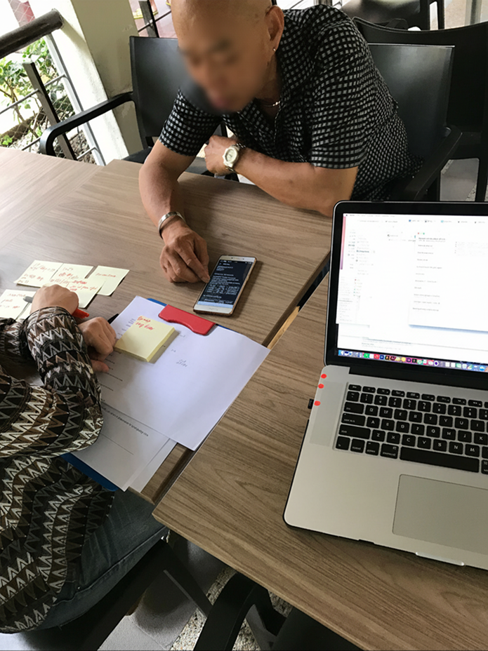
To bridge the gap between our "technically accurate" backend and the drivers' reality, I moved beyond the office. I conducted contextual inquiries, riding with drivers and joining community meetups to observe their financial routines in the environment where they felt most at ease.
The Problem
Key Insight:
The Personal Audit
I discovered that the "Trust Deficit" was fueling a hidden workflow. Drivers were maintaining their own rigorous, manual bookkeeping systems, notebooks scribbled with trip fares, cash-outs, and fuel costs.
During one session, a partner revealed he spent over an hour every night attempting to reconcile his physical "cash in hand" against our complex, fragmented backend logic. This manual "shadow ledger" was his only source of truth. It became clear that our product wasn't just inconvenient; it was unintelligible, forcing partners to do the math we should have been doing for them.


The Problem
Audit:
The Cost of Inconsistency
Following the field research, I conducted a regional internal audit and competitive analysis. Mapping out our fragmented reporting workflows and benchmarked them against both standard financial statements and competitor offerings, which revealed a clear business risk.
At the time, our main competitor’s statement design across markets was not significantly stronger than our Singapore solution. Their real advantage lay in standardisation. From their Amsterdam finance office, they issued a consistent, automated Statement of Account across all markets. In contrast, Grab relied on a patchwork of localised, manual workarounds, requiring country teams to constantly reinvent the wheel.
This wasn't just generating operational inefficiencies. We were steadily losing our professional credibility with our drivers.
The Problem
Synthesis:
Architecting "Nett Earnings"
The design challenge was effectively an information architecture problem. I needed to map the mental model of the driver's notebook onto our complex digital data pipelines.
Consolidating the Inputs
Together with the PM and BE engineer, we mapped the full spectrum of financial flows within the ecosystem. This ranged from special incentives that were partially distributed across the Credit and Cash wallet, to installment repayments for short term loans deducted directly from the credit wallet. These microloans were particularly common among two wheel drivers in Vietnam, who used them to finance essential items such as helmets, shirts and jackets.
The Equation
We re-architected the layout to abstract the complex "Wallet" logic and instead focus on the nature of the transaction. We grouped everything into a simple, human-readable equation: Total Fares + Incentives - Deductions = Take Home Pay.
The Problem
Validation:
Meeting Drivers Where They Are
We moved away from traditional office based usability testing. Inviting drivers to our UX lab in the CBD area created unnecessary tension for some participants and introduced practical barriers, such as finding parking in the Central Business District. This often resulted in delays or last minute cancellations, ultimately impacting the reliability of our sessions.


To create a more natural and comfortable environment, we brought the sessions to locations drivers already frequented during their breaks. We conducted testing at easily accessible McDonald’s outlets with ample parking, such as East Coast Park, ensuring convenience and familiarity.
Sessions were scheduled during off peak hours to minimise disruption to their routines. In this relaxed setting, we were able to validate whether the information hierarchy was intuitive enough to replace their handwritten notebooks. The informal context encouraged more open dialogue and provided more authentic feedback, ultimately strengthening our confidence in the solution’s usability.
Reality Check
When the Solution Doesn't Reach the User
While our primary solution, an automated PDF statement delivered via email, performed well in our initial markets, our rollout in Indonesia hit a critical roadblock...
The Challenge: "Ghost" Inboxes
To understand why, we investigated the local operational workflow and uncovered a profound behavioral insight: while every Indonesian driver had a Google account (a strict requirement to log into the Driver app), a staggering 67% of them did not know their email address or password.
Because many partners didn't have an email address when they first signed up for their Grab Driver account, third-party agents or Grab frontline staff would create a Gmail account on their behalf purely to activate the account. The credentials were rarely handed over to the drivers. As a result, our perfectly calculated financial statements were sitting unread in inaccessible inboxes, leaving the "trust deficit" completely unresolved.
The Adaptation: Bypassing the Inbox
We couldn't retroactively fix thousands of broken onboarding workflows overnight, but we urgently needed to deliver financial assurance. If the drivers couldn't reach the statements, the statements had to reach the drivers.
We pivoted our delivery strategy for the Indonesian market by building a native view-and-download capability directly within the Grab Driver app. By embedding the PDF statements into the History feature, a place drivers already visited daily, we bypassed the email barrier entirely. While born out of the unique constraints of a single local market, this seamless in-app access proved so effective that we subsequently rolled it out as the standard experience across all our regional markets.
Solution
Matching the Mental Model
We architected the information hierarchy to mirror the driver’s reality, transforming fragmented data into a clear and verifiable statement.
A Universal Standard
Moving away from localized, manual workarounds, we established a single, automated Statement of Account across all markets. Delivered both natively in-app (following our Indonesia pivot) and as a universal PDF, it gave drivers a printable record they could use confidently for financial processes such as loan applications and tax reporting.
Tiered Information Architecture
Not all drivers engage with their Weekly Statement in the same way. Our research showed a clear correlation between a driver's trust in the platform and how deeply they scrutinized their earnings data. To serve this range of behaviours, we structured the statement into three progressive layers of transparency:
• At a Glance: Your weekly earnings, simplified
A high-level summary of total earnings, deductions, and take-home pay. Serving drivers who trust the platform and want a quick pulse check without digging into the details.
• Breakdown: Verify the numbers behind your total
A high-level summary of total earnings, deductions, and take-home pay. Serving drivers who trust the platform and want a quick pulse check without digging into the details.
• Full Detail: Every trip, every line item
Complete trip-level transparency. For drivers who want to independently audit their income and trace exactly which rides contributed to their earnings.
Proactive Self-Service
To further reduce cognitive load, we introduced a Glossary for drivers less familiar with financial terminology. The terms derived directly from the most common finance-related Help Centre tickets, effectively transforming the statement into a proactive layer of self-service support.
Outcome & Impact
Reducing Friction, Restoring Confidence
The standardized Driver Partner Statement was rolled out to 1.2M+ drivers across 8 markets, transforming earnings visibility from financial ambiguity to system-level transparency.
Operational Impact Within 90 Days in Singapore
Self-service adoption reduced support dependency and operational overhead:
↓
12.7%
Finance-related CE tickets
The Finance-related Customer Experience tickets dropped from 32.9% to 20.2%
↓
3.8%
Operational costs
The overall Customer Experience operational costs dropped with 3.8 percentage points.
Where the Impact Mattered Most
The improvements were most pronounced among our high-touch segments, our drivers who needed clarity the most:
↓
16.3 pp
Support requests among
Indonesia Bike Drivers
16.3 pp drop in Finance-related CE tickets, from Indonesian Bike Riders after the Partner Statement became available in the Driver app.
↓
9.7%
Support requests among
New Drivers
A 9.7 percentage point reduction in total CE tickets during the first 30 days after a driver completes their first trip.
Reflection
Bringing Systems and User Experience Closer Together
This project strengthened my understanding that even the most reliable backend system only delivers value when users can clearly understand and trust what it communicates. It shaped how I think about the relationship between operational logic and user experience.
Empathy Over Logic
Technical accuracy alone does not guarantee clarity. While our backend calculations were technically correct,they were difficult for our customers to understand and interpret. Spending time with drivers and reviewing their handwritten tracking methods helped me see how different their mental model was from our internal systems. This experience reinforced the importance of designing around user understanding rather than expecting users to understand our system logic.
Designing for Real Conditions, Not Ideal Scenarios
The pivot in Indonesia highlighted the gap between system performance and real world usability. From a metrics perspective, the PDF emails were being delivered successfully. In practice, however, onboarding processes meant many drivers could not easily access them. This was a reminder that accessibility extends beyond interface design. It requires a deeper awareness of operational context and local realities, and adapting the product accordingly.
The Value of Standardisation
What began as an information architecture challenge evolved into a broader service design effort. By phasing out fragmented, local workarounds such as external email tools and spreadsheet based reporting, we introduced a more consistent and scalable standard. Beyond improving clarity, this reduced operational complexity and strengthened alignment across all markets.
Beyond the Partner Statement
Designing a Connected Financial System for Drivers
While the Partner Statement established a consistent standard for weekly and monthly earnings summaries, it represented only one part of a broader financial experience. Creating meaningful transparency required connecting high level overviews with the detailed realities of individual trips in real time.
To close the gap between the macro view of weekly earnings and the micro view of single rides, I moved on to lead the redesign of two native in app features.
Context
Driver Earnings History
I redesigned the native earnings tracker to visualise daily and weekly performance through interactive graphs. This gave drivers a clear view of their progress over time and allowed them to tap into specific days for more detailed insights when needed.

Context
Trip Details, Receipts
To strengthen granular transparency, I redesigned the individual trip receipts. This is the first screen a driver sees immediately after completing a ride, a high anxiety touchpoint where financial clarity is critical.
I approached this receipt as a foundational building block, ensuring that its data structure and visual language aligned seamlessly with the daily earnings shown in the History feature, the weekly performance graphs, and the consolidated Statement of Account. In doing so, we created a connected earnings journey from start to finish.


Context
Driver Earnings History
I redesigned the native earnings tracker to visualise daily and weekly performance through interactive graphs. This gave drivers a clear view of their progress over time and allowed them to tap into specific days for more detailed insights when needed.
Context
Trip Details, Receipts
To strengthen granular transparency, I redesigned the individual trip receipts. This is the first screen a driver sees immediately after completing a ride, a high anxiety touchpoint where financial clarity is critical.
I approached this receipt as a foundational building block, ensuring that its data structure and visual language aligned seamlessly with the daily earnings shown in the History feature, the weekly performance graphs, and the consolidated Statement of Account. In doing so, we created a connected earnings journey from start to finish.
Together, the SOA, the Earnings History, and the Trip Details formed a comprehensive financial picture. By ensuring that the complete earnings path, from a single ride receipt to a weekly statement, was transparent and verifiable, we replaced financial anxiety with clarity and confidence.

Together, the SOA, the Earnings History, and the Trip Details formed a comprehensive financial picture. By ensuring that the complete earnings path, from a single ride receipt to a weekly statement, was transparent and verifiable, we replaced financial anxiety with clarity and confidence.
To respect confidentiality and NDA terms, some details in this case study have been modified or omitted. The views expressed are my own and don’t reflect Grab’s official stance.